 Thayillam Shopping Complex, Ulloor, Trivandrum
 info@thayillampaints.com
 +91 8089089081
 Mon-Sat: 9am-7pm

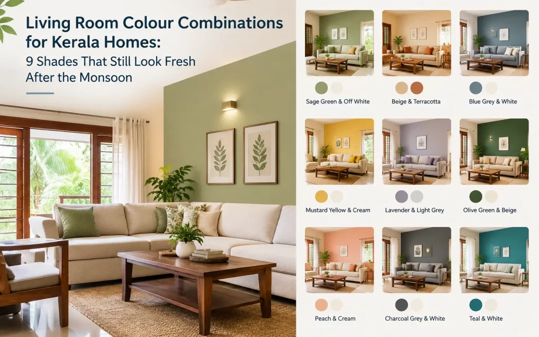
So you’ve decided to repaint the hall. Good. Now comes the hard part, choosing a living room colour combination you won’t regret by July.
We say July because that’s when the doubt creeps in. The paint went on in a sunny week, everyone said it looked lovely, and then the rains settled in. Grey light through the window, a bit of dampness in the air, and suddenly that cheerful wall looks flat. You stand there with your tea thinking, did we pick wrong?
Usually not. It’s just that most colours get chosen for sunshine, and Kerala doesn’t give you much of it for a good three months. We see this at our shop in Ulloor all the time, so here’s what we tell people, nine combinations and our honest thoughts on each.
Our light is not like everyone else’s
Think about your own hall for a second. Coconut trees outside, maybe a neighbour’s wall two metres away, a sit-out roof that blocks the sky. The daylight that comes in is soft and sometimes a little greenish, and in the monsoon there’s hardly any of it. Colours behave differently in that kind of light. Whites turn cold, dark shades make the room smaller, and the clever grey you saw on Instagram can look like dishwater.
So what works? Warm, light colours with a slightly softer edge. Not boring ones, just easier on the eye when the sky is the colour of a steel plate.
1. Warm ivory with soft terracotta
If you want us to just pick one for you, it’s this. Ivory on three walls, terracotta on the fourth, usually behind the sofa. It looks a bit like the old houses with tiled roofs, and it hides scuffs better than white, which is a real blessing with children and visitors and wet umbrellas.
2. Sage green with cream
Green on the outside, green on the inside. It sounds like too much, but a muted sage with cream on the ceiling is calm in a way that’s hard to explain. Works best when the hall opens to a sit-out or a bit of garden.
3. Sky blue with white
Pale blue is for people who feel the heat. It won’t actually cool the room, obviously, but on a sticky evening it does feel kinder. White curtains, light furniture. Please keep the blue pale though, a deep blue on a cloudy day is heavy.
4. Pastel yellow with warm grey
People tell us yellow fades. Soft butter yellow, in our experience, holds up fine, and it’s brilliant in a small hall that never feels bright enough. Warm grey on the opposite wall keeps it from getting sugary.
5. Beige with chocolate brown
Got teak or rosewood at home? Most of us do, somewhere. Beige all round with one chocolate wall and the wood suddenly looks richer. It’s a little old-fashioned, we’ll admit. Some people want exactly that, and it never goes out of style.
6. Peach with off-white
One of our favourites that nobody asks for. Brass lamps look warm against it, and so do festival sarees when the guests arrive at Onam. Off-white on the other walls, and the room gets a soft glow once the lights go on in the evening.
7. Teal accent with light grey
For the slightly braver. One teal wall, the one you see first as you walk in, and light grey on the rest. A white sofa or a couple of cane chairs look smart against it. But only one wall. Do two and it starts to shout.
8. Mustard with cream
Mustard is lovely as an accent and tiring as a main colour. Put it on the wall with the showcase, keep the rest cream, and stop there.
9. Pale lavender with soft white
Honestly, we didn’t expect to like this one. Very pale lavender is restful, and when there’s good daylight it glows a little. If your family is the type to sit and chat long after dinner, this is the room for it.
Before you commit to anything
Go and stand in your hall three times in one day. Morning, noon, and after the lamps are on. You’ll be surprised how different the same wall can look. A shaded room wants lighter, warmer colours, while a bright one can handle something deeper.
Then look at what isn’t changing: the flooring, the sofa you bought in 2018, the big wooden cupboard no one is moving. Your living room colour combination needs to get along with all of it. If you’re stuck, choose the accent wall first and keep everything else quiet.
One more thing, and we say this to everybody. Please don’t settle your interior wall colour combination on a phone screen. Screens push colours brighter or cooler, so that soft shade on a small display may look quite different over a whole wall. Take the shade card home, hold it up in the evening, and see how you feel.
The boring part that saves your paint job
Half the people who come back unhappy with a colour are really unhappy with the wall underneath. Damp spots, rough plaster, old paint peeling beneath the new coat. You can’t fix that with a nicer shade. Get the putty on properly, use a good primer so the paint grips, and pick the right thinner. If you want a textured wall somewhere, sort that out before the colours, because texture changes how a colour looks once it dries.
Looking for a paint dealer in Trivandrum?
If you’re after a paint dealer in Trivandrum who will actually talk to you about your room instead of just handing over a tin, come and see us. So if you’re anywhere nearby it’s an easy trip. Flip through the shade cards, ask whatever you like, and take home primers, putty, thinners, brushes and wall texture all in one go. A photo of your hall on your phone helps a lot.
Frequently asked questions
Which living room colour combination is best for Kerala homes?
There isn’t one answer but light warm pairings like ivory and terracotta, beige and brown or sage and cream suit most homes here. They handle the humidity and the weeks well.
Which interior wall colour combination looks good in the monsoon?
Soft warm ones. Peach, yellow, cream and light sage keep a room cheerful when the sky is grey. Dark colours tend to make it feel closed in.
Should all four walls be the colour?
They can be,. One accent wall gives the room more life. The wall behind the sofa or the TV is the choice.
How often do I need to repaint the living room?
With prep and a decent quality paint a good number of years. Cheap paint often needs redoing and labour charges only ever go up so spending a bit more at the start usually works out better.
Can I pick a colour from my phone?
For ideas, fine. For deciding, no. Look at the shade card and test it on your own wall if you can.
Do I really need a primer?
Yes. It helps the paint grip evenly. Gives a smoother finish and in a damp climate like ours it matters even more.
Where can I find a paint dealer in Trivandrum or a paint shop in Ulloor?
Thayillam Paints in Ulloor. Come in look at the shade cards. Pick up primers, putty, thinners, brushes and wall texture in one trip.
Recent Comments